Allied Works/architectural portfolio
| portfolio | alliedworks.com |
| years | 2014 / 2017– |
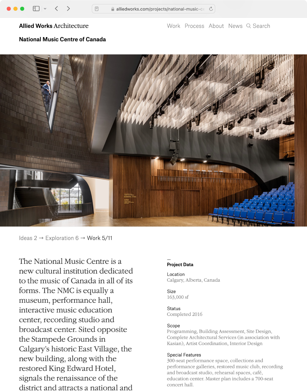
Based in Portland and New York, Allied Works is a multi-disciplinary architecture firm whose process is as distinctive as its buildings. Our goal with the portfolio was to let the imagery speak for itself, with a focus on sketches and design explorations as much as the finished products.
Each project tells a full story of abstract ideas and real-world constraints finding their synthesis in a new structure.
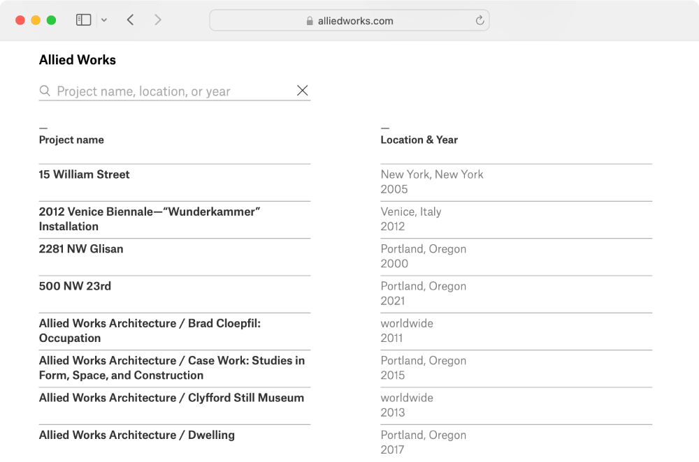
The entire catalog can be filtered and sorted through a live-search interface.
Bloomberg/visual data
| prototypes | bloom.samizdat.co |
| years | 2011–2013 |
I served as both interaction designer and the development lead for the groundbreaking data journalism initiatives created by Lisa Strausfeld’s award winning Visual Data team at Bloomberg.
Once design lead Hilla Katki had created concept sketches and our team narrowed the datasets, I exhaustively explored the data, refined the visualizations, and designed the fluidly interactive user interfaces before building the final products—both front-end and back.
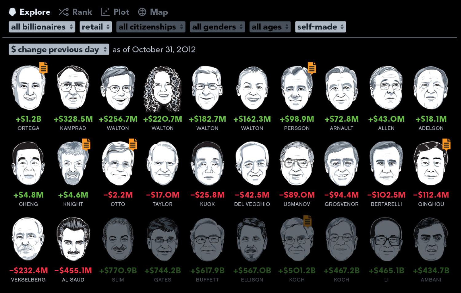
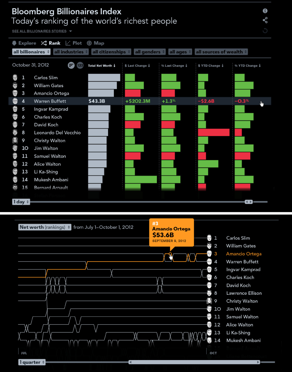
The Bloomberg Billionaires Index is a continually updated ranking of the world’s richest people. The data can be sorted and filtered based on demographics, industry, and family background. The different chart types give different views of the changes in the index over time.
The site was included in the Nate Silver-edited The Best American Infographics 2014 and can still be viewed at the prototype link above.
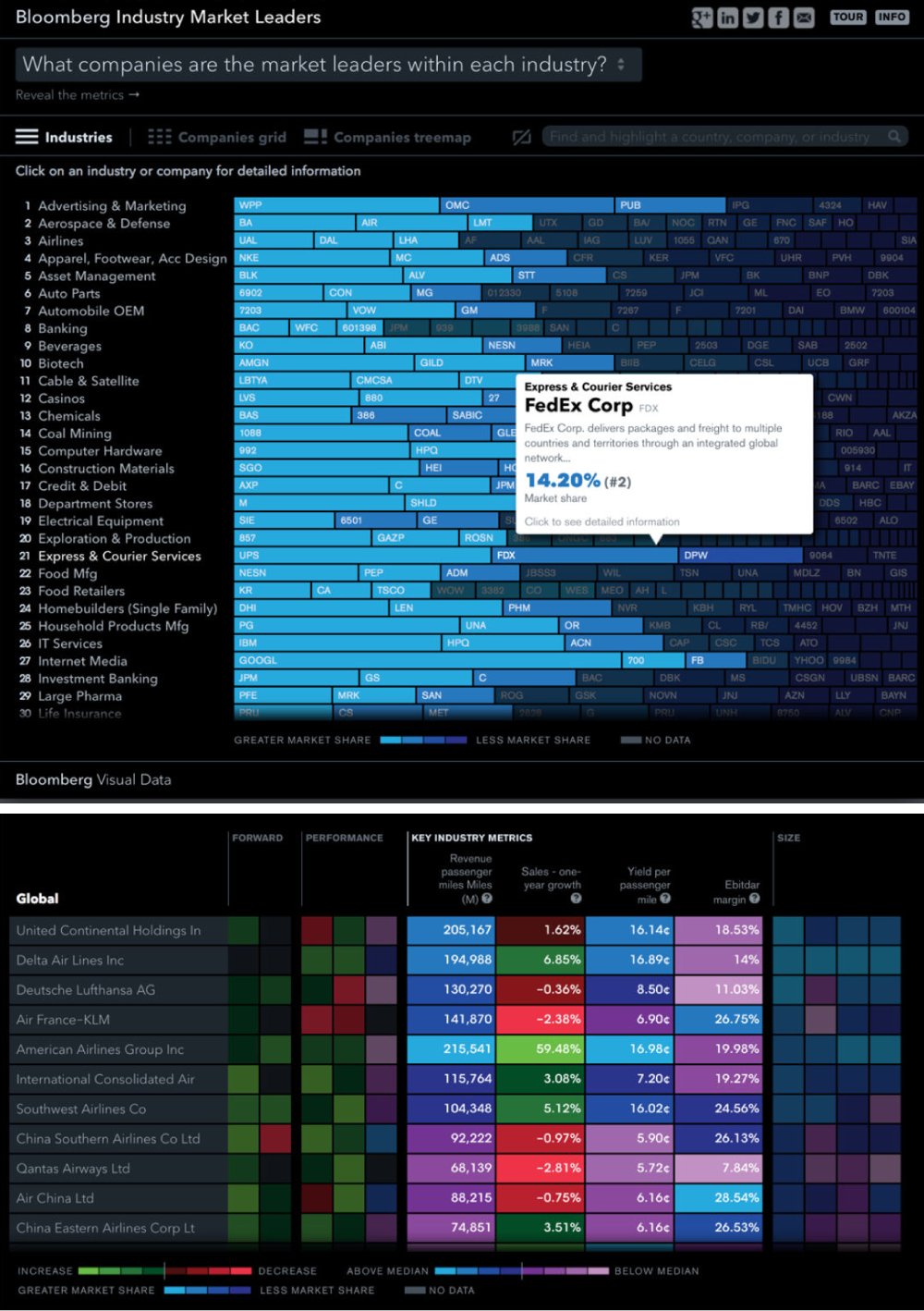
The Industry Leaderboard site provides an at-a-glance summary of the different industries in the world economy and the relative positions of the companies that compose them.
Color, scale, and ordering allow for the most salient information to bubble up.
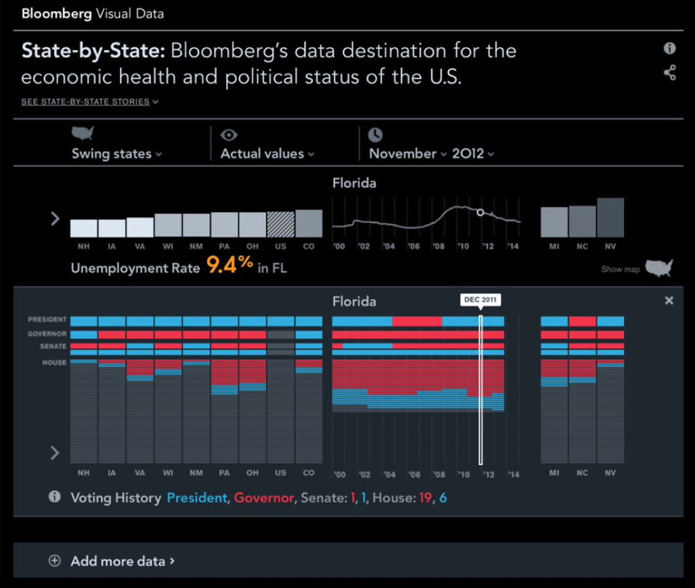
Built in the lead-up to the 2012 election, the State-by-State dashboard showed the United States as a spectrum of fifty isolated states. Selecting a particular metric would reorder all the states, inviting emergent discovery of correlations with other attributes.
Critical MassCitibank/account dashboard redesign
| year | 2015 |
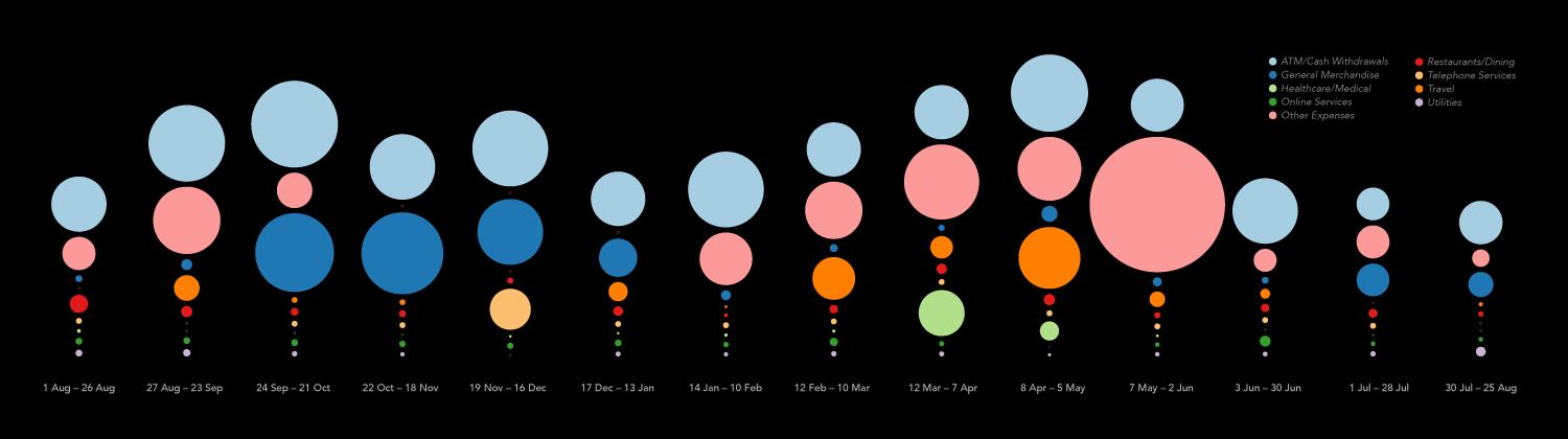
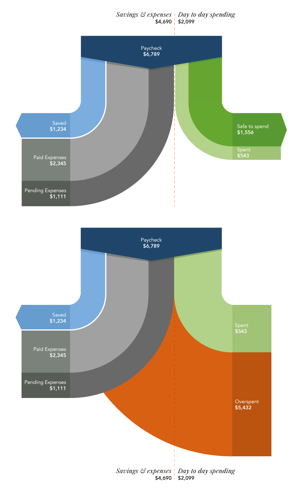
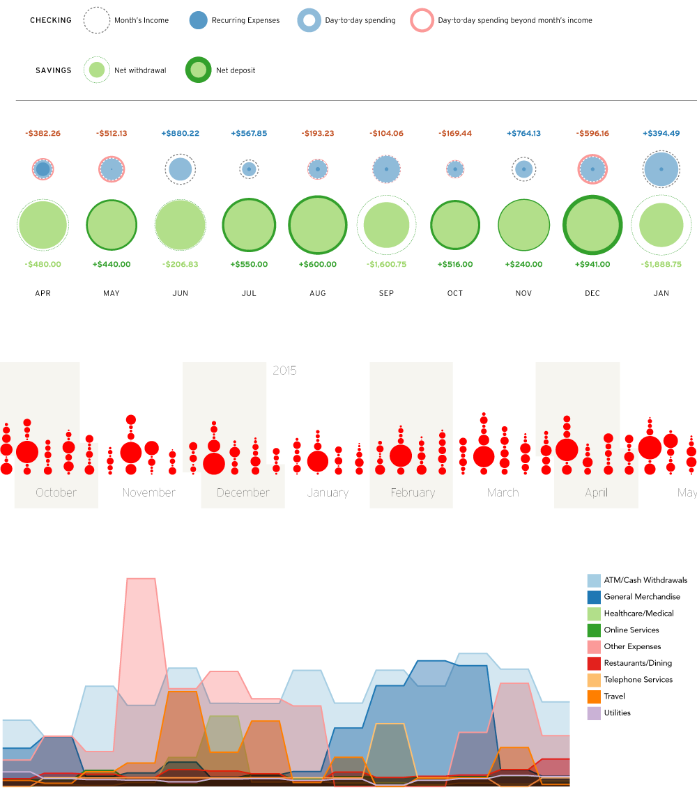
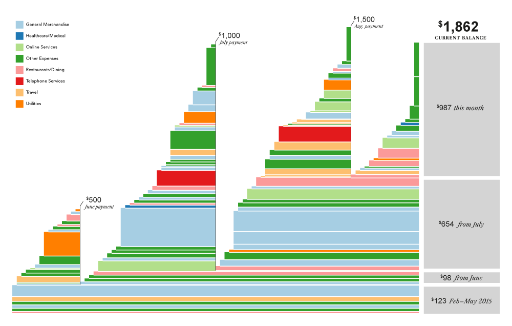
When Citibank wanted to redesign the dashboard seen by credit card customers, I was brought in to explore new ways of visualizing cash flow, savings, and monthly budgets. Working with actual account data—and approaching it as a data-mining challenge—I transformed recurring financial patterns into visual ones and found ways to make the most salient events eye-catching.
These Sankey diagrams show an entire month’s spending at a glance, revealing the remaining balance in one’s budget (top figure) or flagging excess spending (bottom figure).
Making sense of day-to-day transactions requires understanding different categories of spending rather than getting lost among the individual charges.
These sketches group purchases by time and type, making clear both the cycles of recurring costs and ‘outlier’ events that warrant closer inspection.
This view shows the accumulation of debits and partial-payments over the months. New charges layer atop one another and payments cause sharp vertical decreases.
Unpaid purchases at the base are grouped by the time period in which the charges were originally made—using time as another way of understanding how far ‘behind’ on payments one may be.
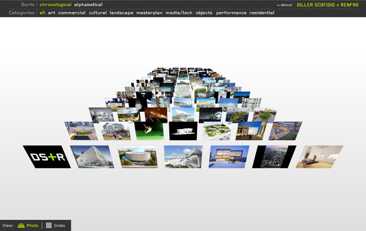
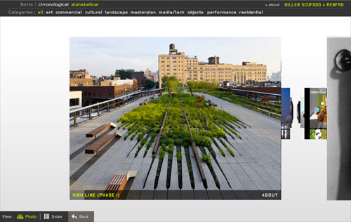
pentagramDiller Scofidio + Renfro/Not a desktop metaphor
| press | pentagram.com |
| year | 2008 |
This portfolio website for the artists and architects at Diller, Scofidio + Renfro was designed in collaboration with Takaaki Okada & Lisa Strausfeld at Pentagram and developed by me in Actionscript. The spatially organized, sortable user interface rides the line between unconventional and highly usable—pulling the viewer into an immersive world of imagery and 3D animations.
Projects can be filtered by category, allowing for simple, spatially memorable queries of the dataset.
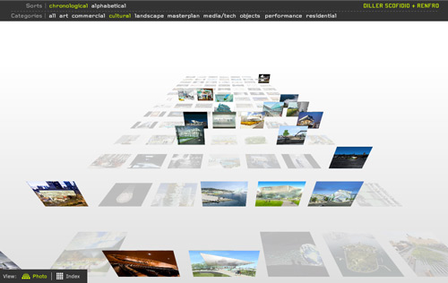
Within each project is a navigable slideshow of photos, sketches, and construction details.
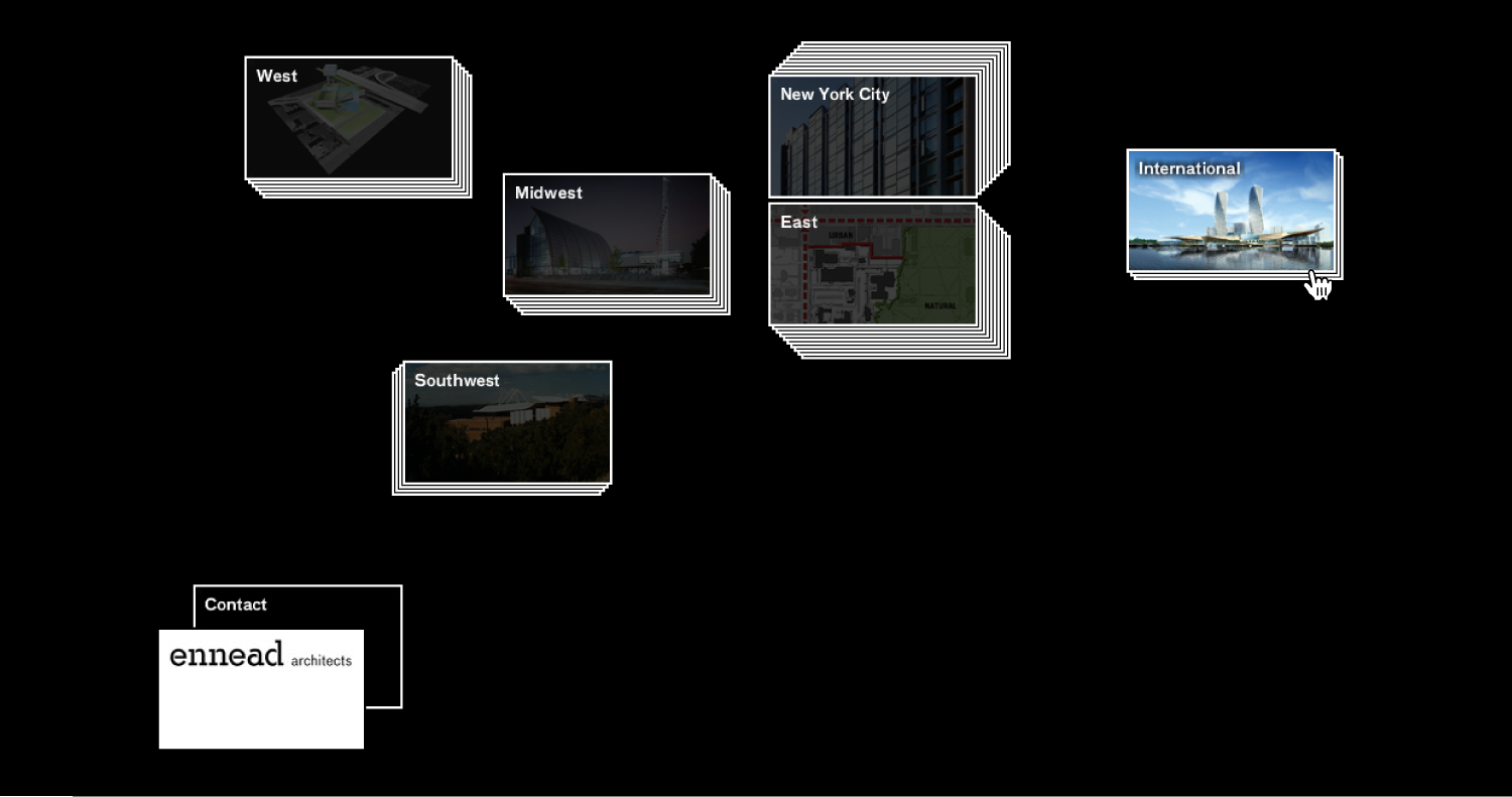
PentagramEnnead Architects/a reshuffled architecture portfolio
| years | 2010–2014 |
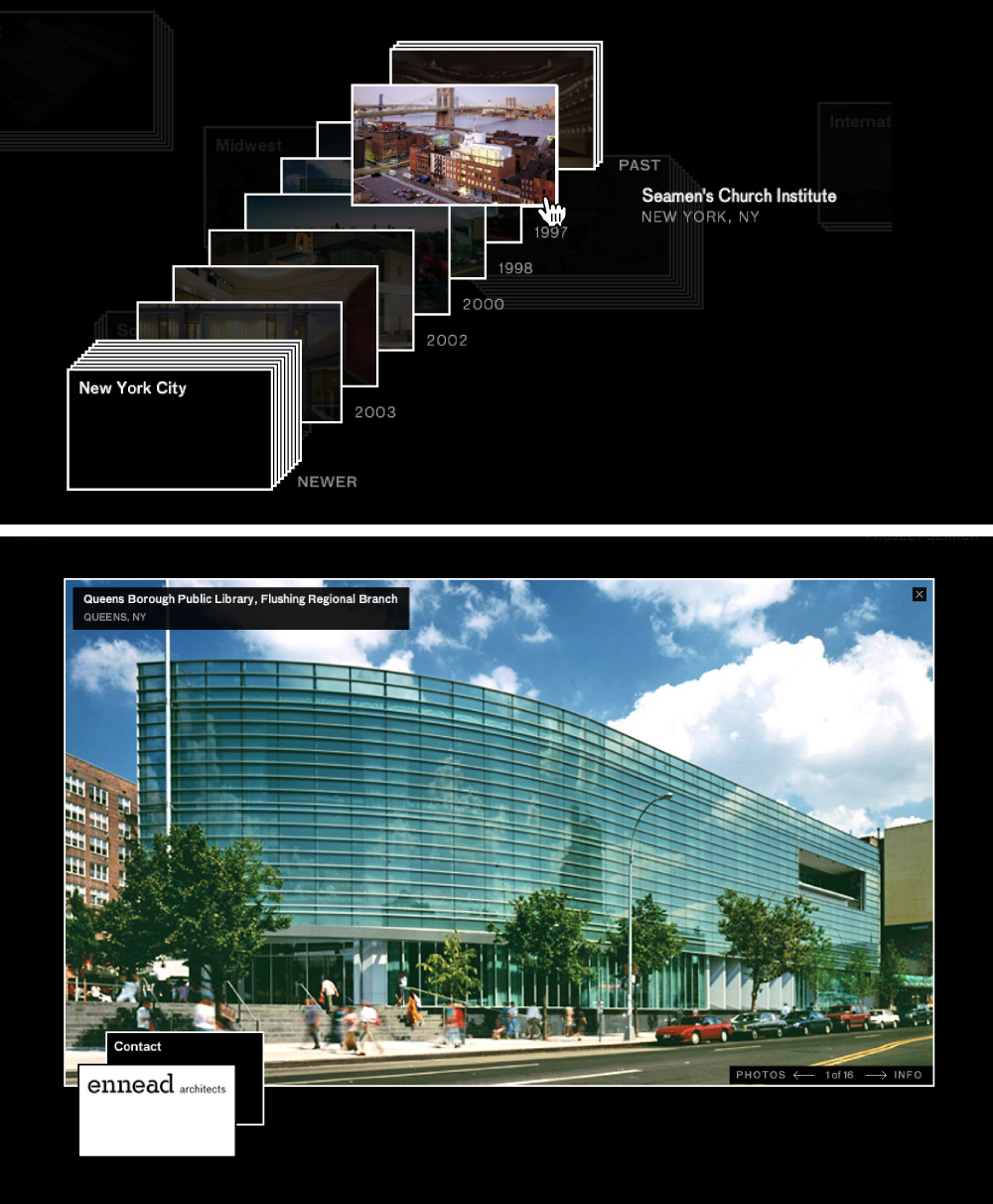
The Ennead site was created at the end of the Flash era and eschewed the standard multi-page format in favor of a deck-of-cards metaphor. Projects, people, and topics were represented by dedicated cards which could be stacked, sorted, and shuffled as visitors navigated the site.
The entire content of the portfolio is displayed on the landing page. Clicking on a card or stack layers it atop the pile rather than navigating to a new page.
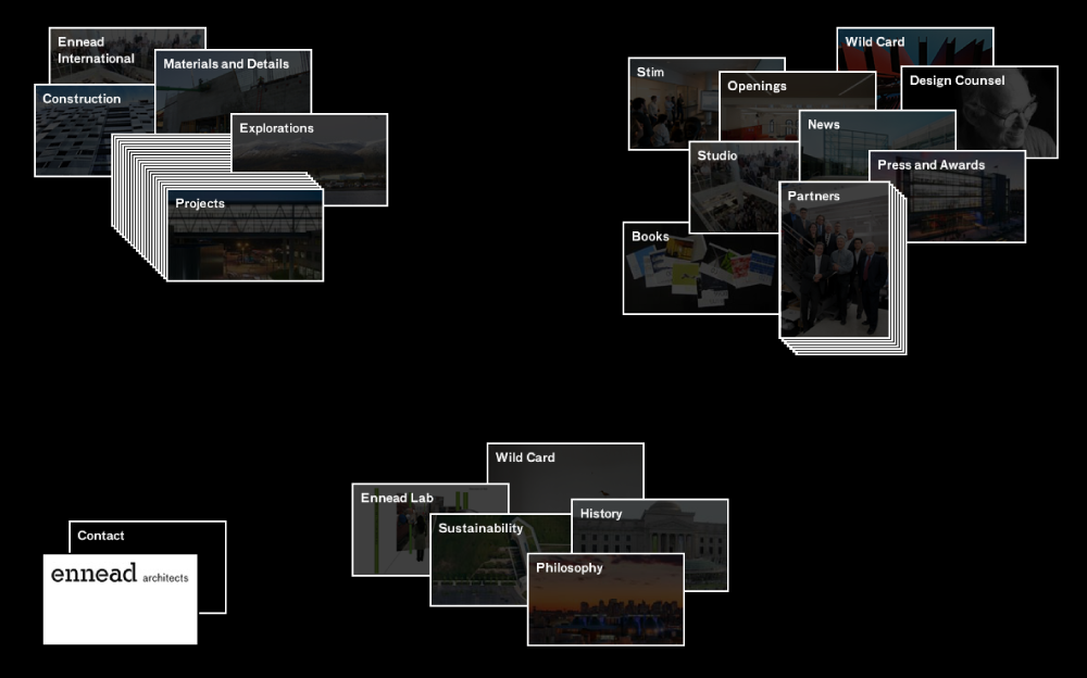
Projects could be filtered by location or type and then sorted chronologically and viewed one at a time.
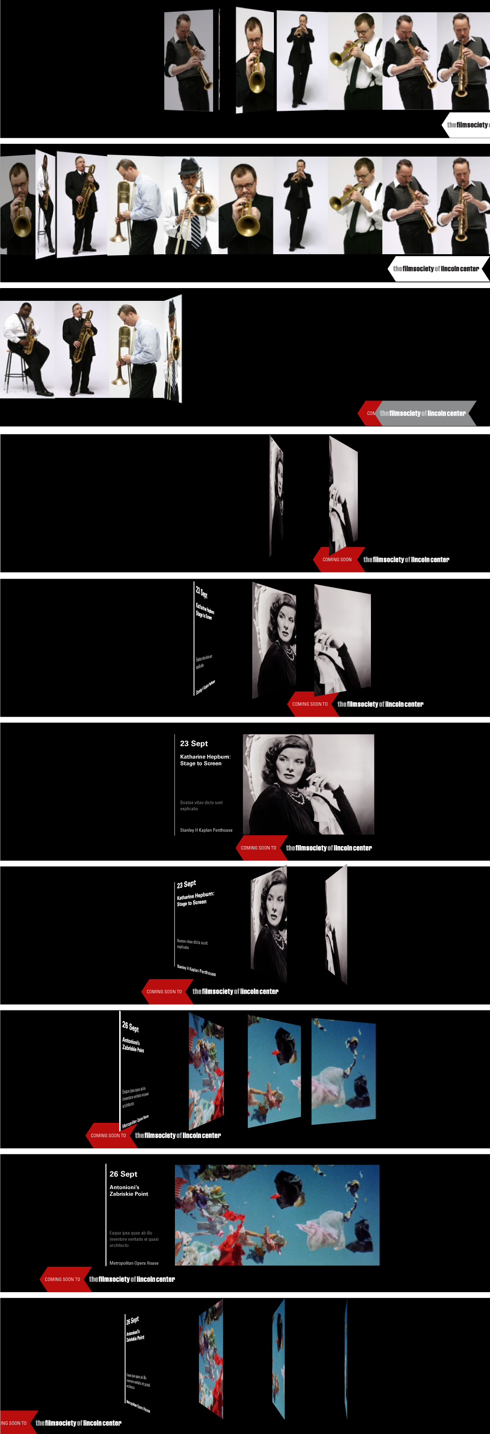
PentagramLincoln Center/dynamic wayfinding
| year | 2009 |
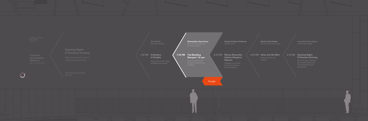
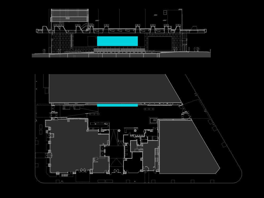
The Rubenstein Atrium is a Privately Owned Public Space at the edge of the Lincoln Center canvas. It functions as both the Center’s box office and an event space in its own right. I prototyped the typography and motion graphics for a 40-foot-wide projection screen that runs along its main hallway as part of the signage project designed by Michael Bierut’s team at Pentagram.
When not in use for a film screening or live performance, the main display (in blue) provides a dynamic display of upcoming events.
In addition to cycling through all of the institutions that make up Lincoln Center, the animation loop featured subtle right-to-left animations and a persistent arrow motif to direct visitors toward the hallway leading to the main campus.
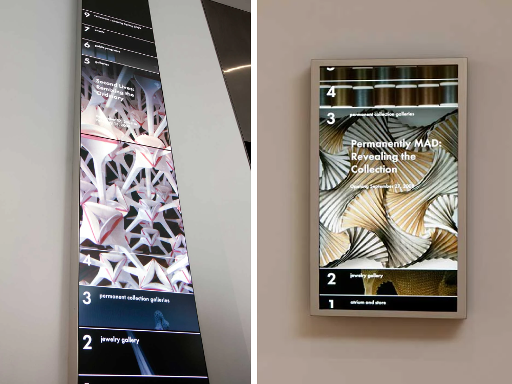
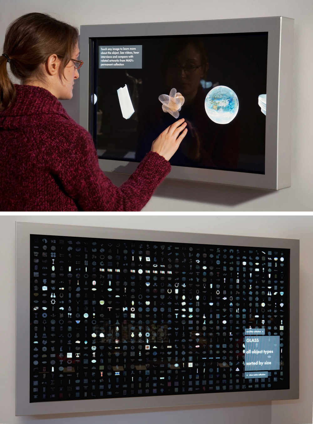
PentagramMuseum of Arts & Design/Signage meets motion graphics
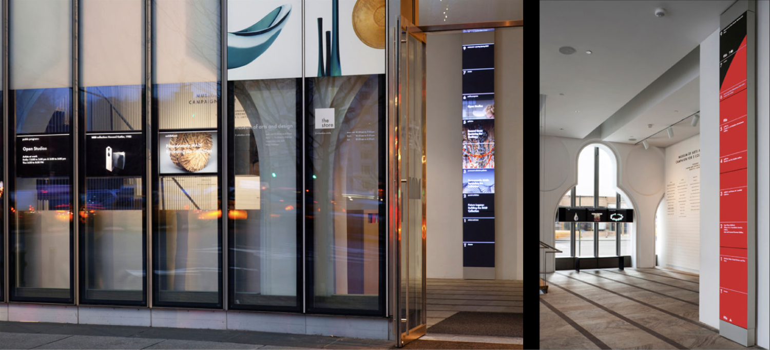
| press | pentagram.com |
| year | 2007 |
As part of their move to Columbus Circle, the Museum of Arts and Design commissioned Pentagram to create a graphic identity and signage system for the new space. I worked on the design of the video-based wayfinding system, which directs visitors to exhibits spread out over the building’s ten stories.
In addition to prototyping the animated displays next to the elevator on each floor, I contributed a grid-based exploration interface for exploring the full collection using a large-format touchscreen.
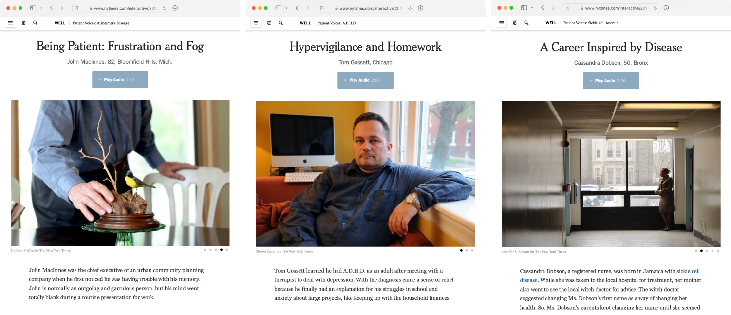
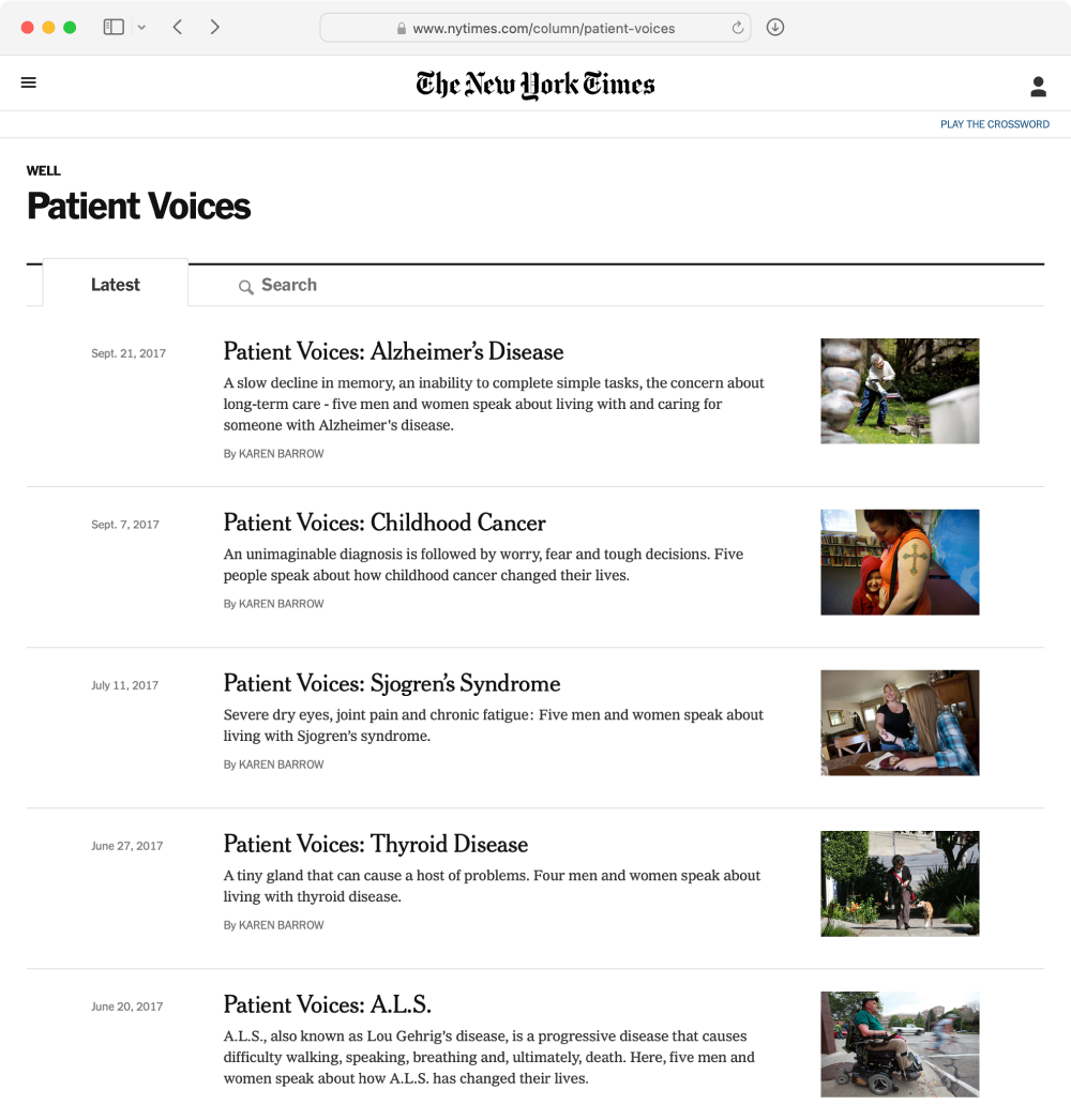
New York Times/patient voices
| articles | table of contents |
| year | 2016 |
Patient Voices is a series of interviews capturing the stories and oral histories of individuals living with a variety of chronic conditions. The key design challenge was seamlessly integrating audio recordings and slideshows into the text narrative.
Each page consists of several people telling their stories. The audio player I built smoothly transitions between recordings as the reader scrolls the page, creating a chorus of shared experience among the voices.
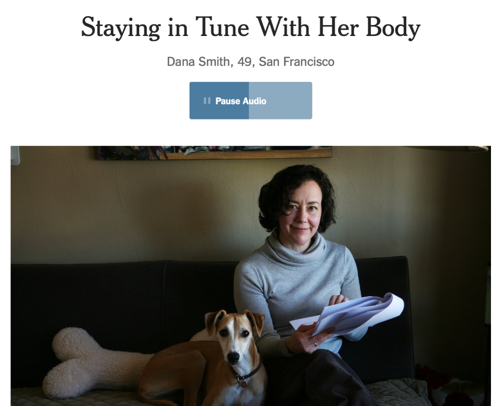
The pages are grouped by medical condition, allowing readers to find their own community of fellow travelers and realize they are not alone.
Our World in Data/matters of import

| prototype | health & wealth |
| redesign | blog post |
| year | 2023–4 |
Our World in Data is a research organization within Oxford University dedicated to publishing articles and information graphics explaining the most significant issues facing the world today. My work ranged from creating custom visualizations in collaboration with researchers to designing and implementing new features for Grapher, the software that powers the site’s interactive charts and graphics.
Our redesign of Grapher focused on establishing a rational hierarchy of typographic and interactive elements, making charts easier to read ‘at a glance’ while also enabling deeper exploration.


I designed a consistent visual language for ‘details on demand’ and developed a web component that presents data values in the manner best suited to each of the dozen visualization types grapher supports.

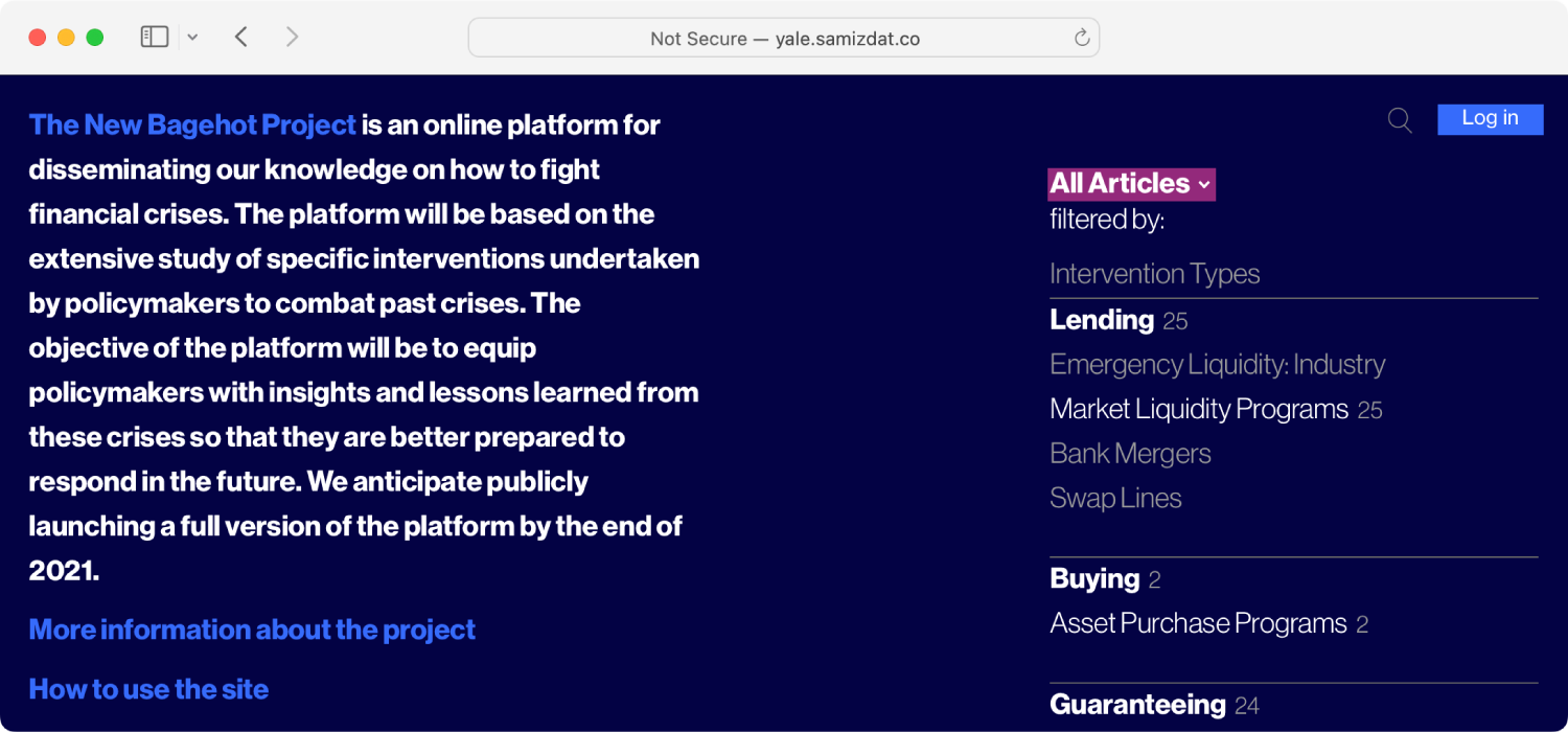
informationartYale University/the new bagehot project
| prototype | website |
| year | 2019 |
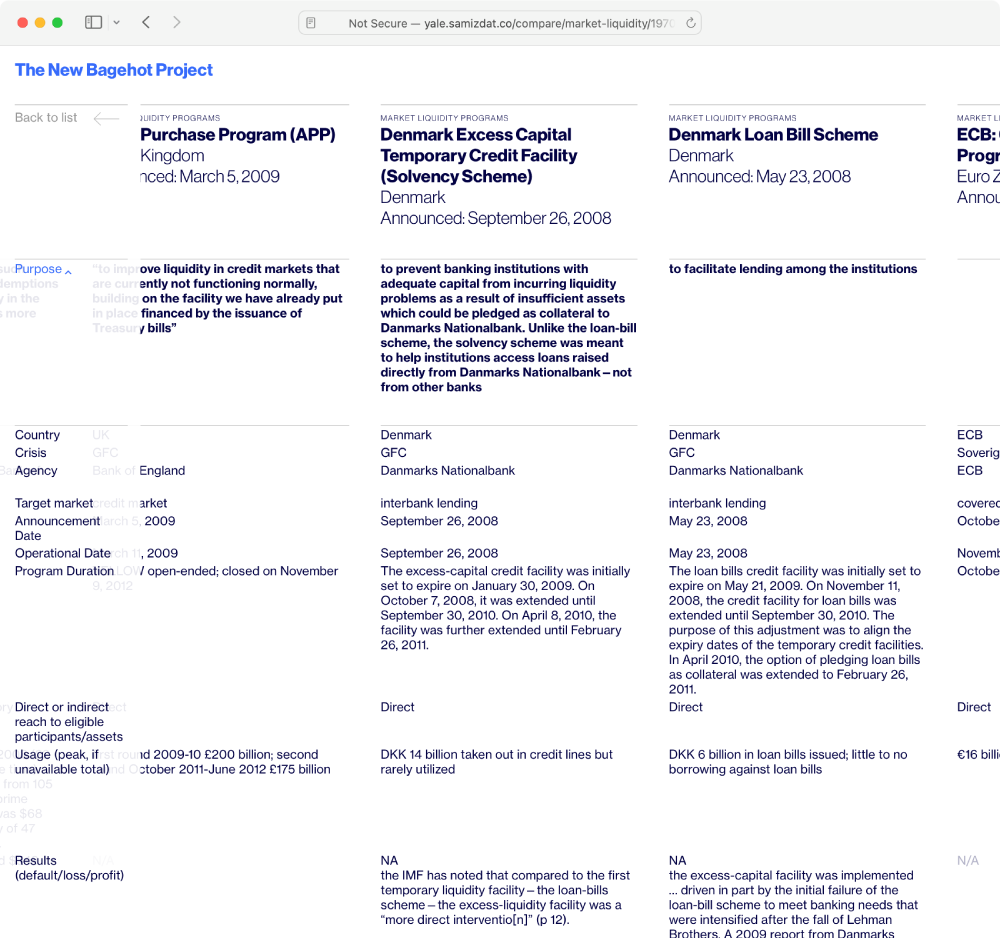
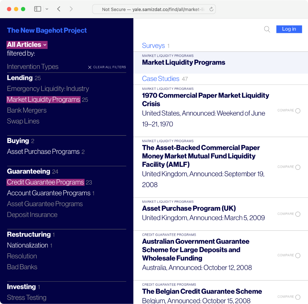
The Yale Program on Financial Stability aspires to prevent future financial crises by better understanding history. The website I built for their New Bagehot Project aims to catalog each past crisis and evaluate the policy response in terms of strategy and effectiveness.
Organized both by historical event and intervention type, the case studies in the catalog allow policy makers to view financial crises through either a diagnostic or prescriptive lens. The filter-based sidebar interactively narrows the hundreds of academic papers down to the most relevant subset.
When a single approach has been used in multiple historical episodes, the similarities and differences can be compared in a multi-column view.