The slides from my thesis presentation.
In each of our heads lies a machine whose R&D time must be measured in millennia, has a parts count in the hundreds of billions, and a wiring scheme containing a quarter of a quadrillion connections. Through a degree of parallelism seen few other places in nature, the brain is able to process huge amounts of sensory information in real time and without our having to expend any mental effort. Yet the irony of our conscious experience is the linear character our thoughts take on when we express ourselves using words.
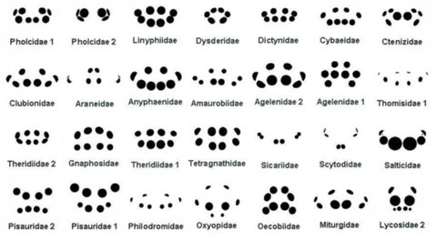
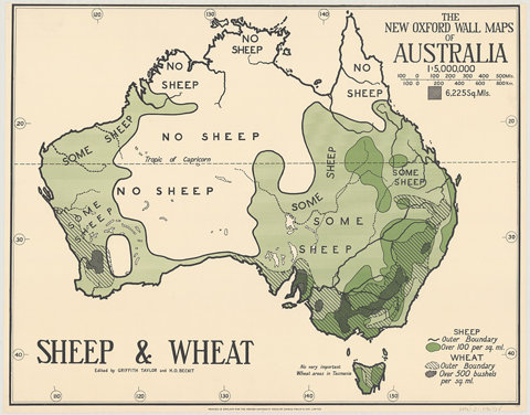
Despite the primacy of language in constructing ideas and models of the world around us, there are places where our parallel nature peeks through and this seriality of thought is exposed for the façade that it is. Perhaps the most vivid is the ability of our visual system to process diagrams containing hundreds of data points in a single glance and immediately see patterns that would elude us when confronted with an equivalent table of figures. Finding ways to map abstract quantitative information into a form that takes advantage of the brain’s parallelism is the fundamental challenge of information design.
Pattern Recognition is a response to both the near magic of this capability and the increasing necessity of making use of it as the amount of data in and about our world grows at ever accelerating rates. To that end, data is both the subject of my investigation and the raw material for the experiments within. Though my principal concern is communicating the information within a dataset to the viewer, it is impossible to divorce this aim from formal concerns. After all, in a diagram the form is the information.
Thus the work that follows is split between two goals. The first is to represent data in such a way that its internal structure reveals itself visually, providing insights that could not be gleaned through textual analysis. The other is to investigate the formal qualities of these computationally generated, ‘found’ patterns.
The choice of subject matter is intentionally far-ranging, including Google’s HTML coding habits, the syntax of a finch’s song, and the harmonic relationships in a Bach fugue. But in all these cases there are systematic relationships between the parts of these wholes which visualization is uniquely positioned to depict – and much beauty hiding in the spaces between the tags, syllables, and notes.
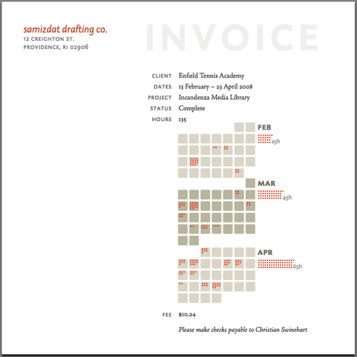
Samizdat Drafting Co. | Invoice Template
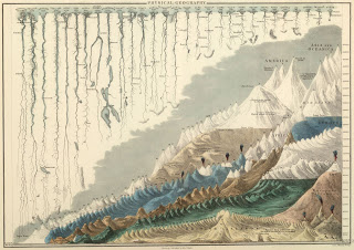
Farewell Edward Lorenz
Hegel via Morgan Meis
This is roughly like looking at Bach’s DNA and hearing the Little Fugue in your head.”
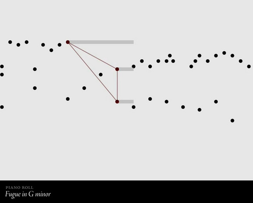
piano roll animation | bwv 578
biographic
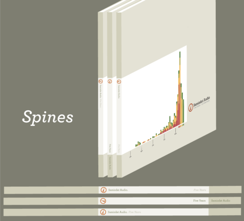
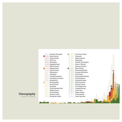
compilation project | possible spines
compilation project | elaborated design
Walter Benjamin
Illuminations: Essays and Reflections

Susan Sontag
compilations compiled | front cover
compilations compiled | back cover
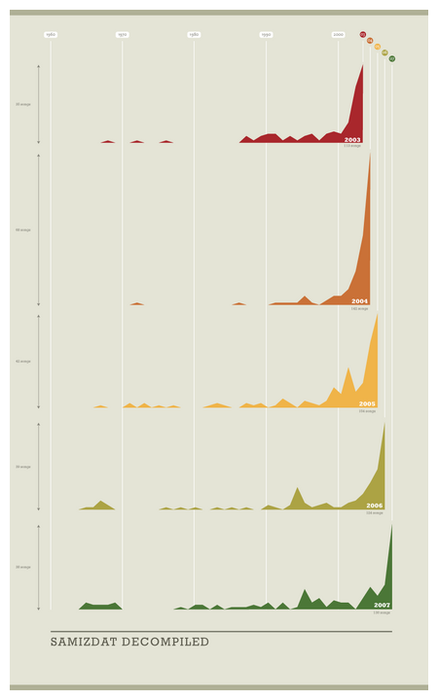
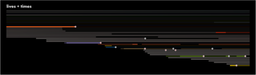
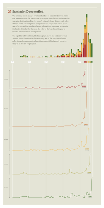
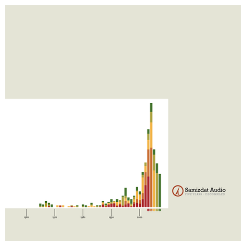
samizdat audio | year histogram
Jane Jacobs
The Death and Life of Great American Cities
Jane Jacobs
The Death and Life of Great American Cities
Jane Jacobs
The Death and Life of Great American Cities
Bookmarks
So glad Tom & Nancy taught me this '3 level' lesson at an impressionable age
the gasoline alley strip is especially gorgeous
tom bissell taking stock of literary stunt-pilotry
the chiptune singularity cometh…
making the USGS look shoddy in comparison
Tom Coryat was a man who knew how to title a book
Jasmin Blanchette making some good points (via QT of all things)
the endpapers of black hole but with faces you recognize
would love to hear their version of the assault on precinct 13 theme...
maybe they'll take down the world's worst piece of signage now
the sound of ray davies applying for a job at the radiophonic workshop
a gift shop that doubles as a history of graphic design
many personal favorites on this list
there's something almost charming about the early days of computer viruses
they knew how to make music television back in the day
Found

Ocular micro-tremors and retinal blur explain it all